How we build
Will your website work on the foldable iPhone Duo?
Apple's foldable iPhone is unlikely to trouble a well-built website, but its two short screens can expose one designed for only a few screen sizes.
7 min read
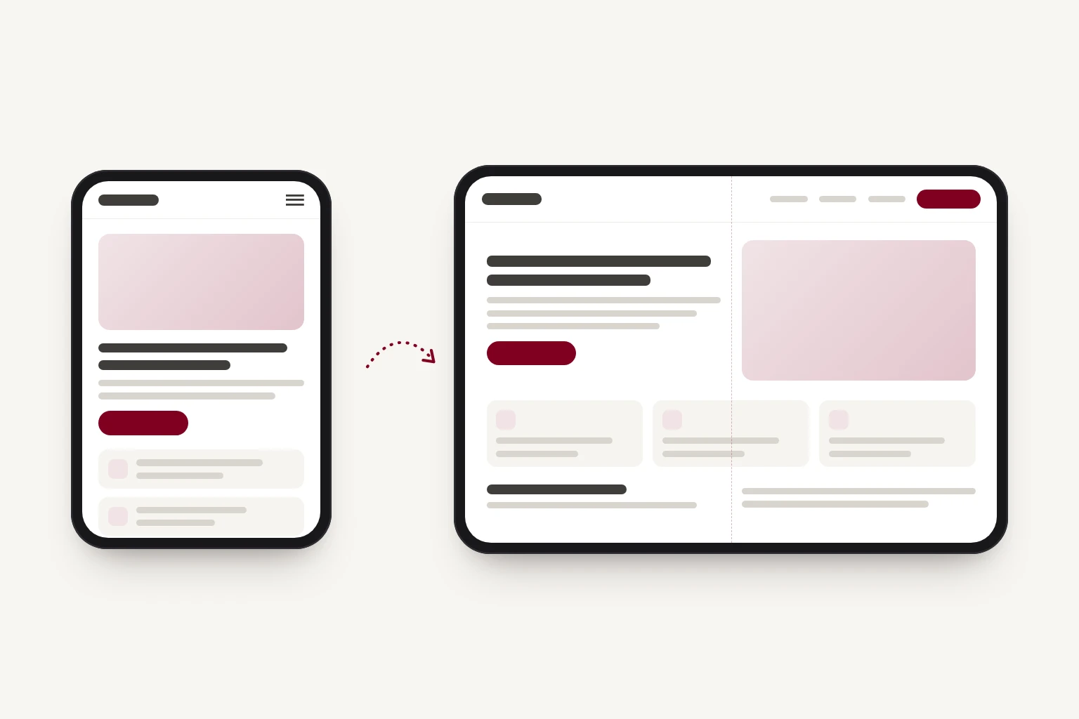
If your website adapts smoothly to different screen widths, it will very likely look fine on Apple's new foldable iPhone, the iPhone Duo. If it was designed for a phone and a laptop and not much in between, the Duo is a good reason to check it. Both of its screens are shorter than a recent iPhone, and the page can change size while someone is reading it.
Apple announced the iPhone Duo on 9 September. Pre-orders open on 16 October, and it goes on sale on 23 October. Folded, it has a 5.4-inch screen on the outside. Unfolded, it has a 7.6-inch screen that's wider than it is tall, a little like an open passport.
Many sites will be fine
When the Duo was announced, a number of developers pointed out that a site which works on an iPad will probably work on a foldable. For a well-built site, they're right.
A browser does not know it's on a foldable. It has a window of a certain width and height, and a responsive website arranges itself to fit the window it's given. To that kind of site, the Duo is two more window sizes.
So there's no need to rebuild anything. There is one question worth answering: was your site designed to adapt to a range of widths, or to a few particular ones? Many sites are the second kind, often because they were designed as two mock-ups, one for phones and one for desktops.
Both screens are shorter than you might expect
Web pages are laid out in CSS pixels rather than the physical pixels a phone's specifications list. On recent iPhones, one CSS pixel is three physical pixels across, so the iPhone 18 Pro's 1206 × 2622 screen is 402 × 874 to a web page. Early third-party measurements put the Duo's outer screen at about 466 × 678 CSS pixels and the inner screen at about 890 × 626.
The outer screen is a little wider than earlier iPhones, which rarely causes trouble: 466 is still comfortably phone-sized. The height is the part to check. The outer screen is about a fifth shorter than an iPhone 18 Pro, the inner screen is shorter again, and Safari's own bars take some of what is left.
That makes the first screenful, the part of a page a visitor sees before scrolling, smaller than on the phones your site was probably tested on. A section designed to fill the screen, with a large heading, a paragraph, two buttons and a row of logos, can overflow it. A sticky header, a cookie banner and a booking bar pinned to the bottom can cover a large share of the screen between them.
The screen changes size while someone is reading
A visitor can be halfway down a page, unfold the phone, and the window roughly doubles in width without the page reloading. Rotating a tablet does something similar, but many sites are only checked by loading them fresh at each size.
The inner screen can also run two apps side by side, including two Safari windows. Apple calls this Split View. Your site may appear at around half the unfolded width, which is phone-sized, on a device that feels more like a small tablet.
Where sites tend to struggle
None of these problems are specific to foldables. The Duo makes them more likely to be noticed.
Layouts designed at two sizes. If a site was designed at phone width and laptop width, the sizes in between may never have been checked. Navigation can crowd its row, three cards can squeeze into space meant for two, and lines of text can stretch across the whole screen. Checking the full range of widths finds these. Letting each part of the page respond to the space it has fixes many of them, and the CSS feature for that is called container queries.
Sections set to fill the screen. A section set to the full height of the screen (100vh in CSS) can overflow on a short one. A minimum height, using the newer svh and dvh units, lets the section grow when its content needs more room.
Code that measures the screen once. Some sliders, sticky headers, menus and animation libraries read the screen width when the page loads and do not check again. When the phone unfolds, they stay at the old size. The fix is to respond when the size changes, which is what ResizeObserver is for, and to test by resizing a page that's already open.
Layouts chosen by device name. Code that detects an iPhone and serves a phone layout will get it wrong on a 7.6-inch iPhone screen. Decisions based on the space available hold up better.
Pop-ups sized for a tall phone. Cookie banners, chat widgets and newsletter pop-ups can cover much of a short screen. Capping their height, and making sure they can be closed without scrolling, keeps the page usable.
Images cropped to fill a box. At an unusual shape, a cropped image can lose its subject: a head cut off at the top, or a product pushed off the side. Setting a focal point (object-position in CSS) keeps the important part in view.
Apple's apps move their controls, and websites do not need to follow
On the Duo's wide, short layouts, Apple moves some app controls, such as back buttons, toolbars and tab bars, from the top and bottom of the screen into a strip down the side. It frees up height and keeps the buttons within reach of a thumb.
That's a convention for apps rather than web pages. Safari's own controls may move, but your site's navigation is best left where visitors expect to find it. Two things do carry over.
- Keep content clear of the edges. If your site extends to the very edges of the screen (the
viewport-fit=coversetting), use the safe-area insets in CSS, left and right as well as top and bottom, so nothing sits under a system control. Apple has not yet said exactly how Safari lays out on the Duo, so this is one to check rather than one to worry about. - Web apps can borrow the idea. If you have a web app, such as a booking system, a customer portal or an internal dashboard, a slim column of navigation down the side is a sensible layout for wide, short windows. It leaves more height for the content people came to work on.
A ten-minute check
You can do most of this before the phone goes on sale.
- Open your site in Chrome, Safari or Firefox and turn on responsive mode. In Chrome, right-click the page, choose Inspect, then click the device toolbar icon.
- Set the width to about 460 and drag it slowly up to about 900. Watch for anything that jumps, overlaps, wraps awkwardly or runs off the edge.
- Set the size to 466 × 678, then 890 × 626, and scroll the whole page at each. Look at the first screenful, the navigation, and anything that stays fixed on screen.
- Load a page narrow, then widen it without reloading. Try it with the menu open and with a slider running.
- Try your most important actions at both sizes: the contact form, a booking, a checkout, tapping your phone number.
- From 23 October, try your site on a real one if you can. Apple Stores and many phone shops usually have demo units of new phones.
If everything holds up, your site was built to adapt and there's nothing more to do. If something breaks, the fix is often small, and you'll have found it before your customers do.
Designing for a range of widths
Phones and computers have not come in two fixed screen sizes for a long time. The range between them keeps widening, and the Duo adds two new shapes to it. A site built to adapt across that range will usually handle a new device without changes. A site built for a few sizes needs checking each time one arrives.
If your check turns up something you'd like help with, you can tell us about it.
Our free website health check covers different ground. It looks at your page at one standard phone size, using Google's own test, and checks its loading speed, text size and tap targets rather than the range of widths above.
iPhone and iPhone Duo are trademarks of Apple Inc. This article is independent and not affiliated with or endorsed by Apple.